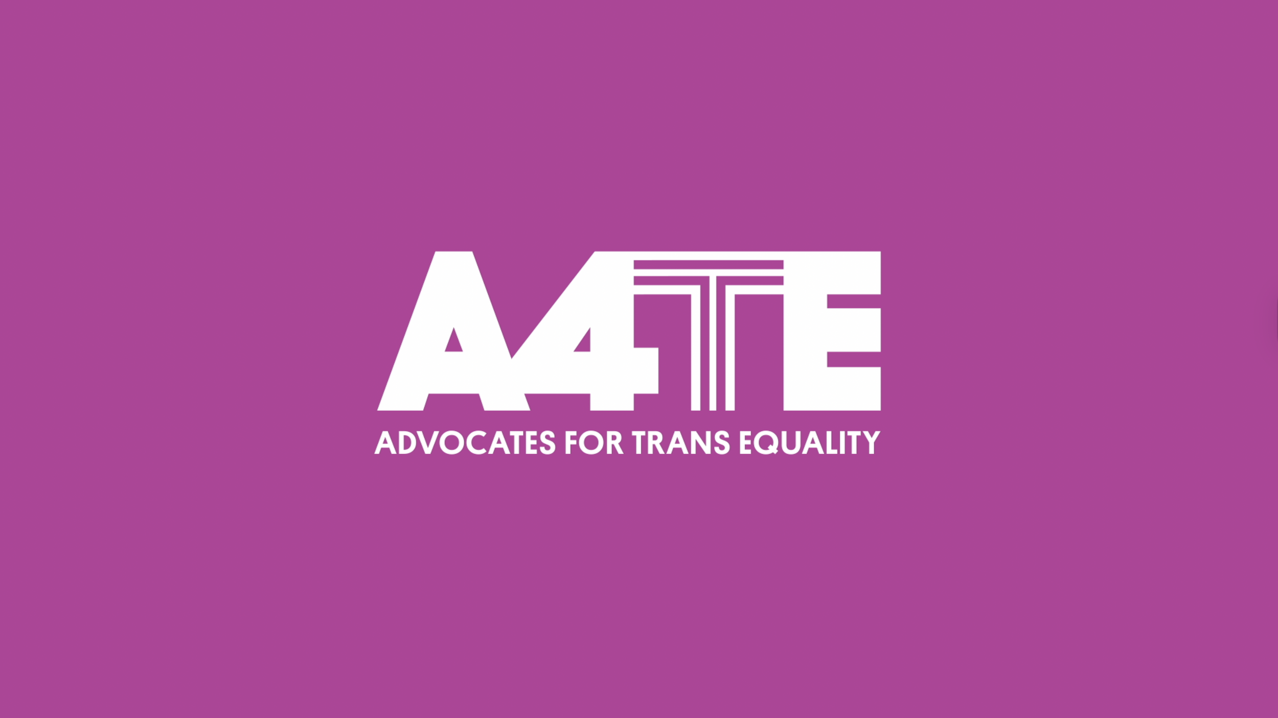
A4TE
PROJECT
A4TE, a new advocacy organization fighting for trans equality in America, is represented through dynamic animations that encapsulate its mission and values.
We created a video reel introducing A4TE, formed by merging the National Center for Transgender Equality and the Transgender Legal Defense and Education Fund.
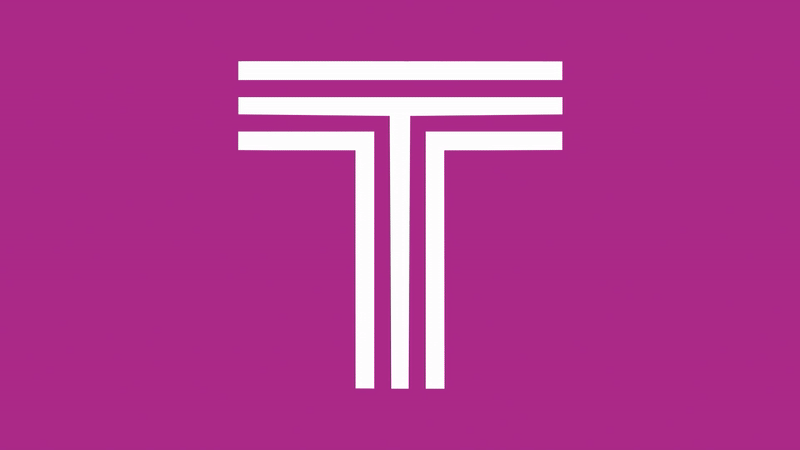
One of the main elements of A4TE's brand identity is the 'T' symbol. This 'T' morphs and transforms in various ways, representing the principles of inclusion and diversity. By animating the paths of the 'T', we aimed to reflect the multifaceted nature of the trans community and the organization's commitment to equality. Each transformation of the 'T' signifies a step towards a more inclusive society.
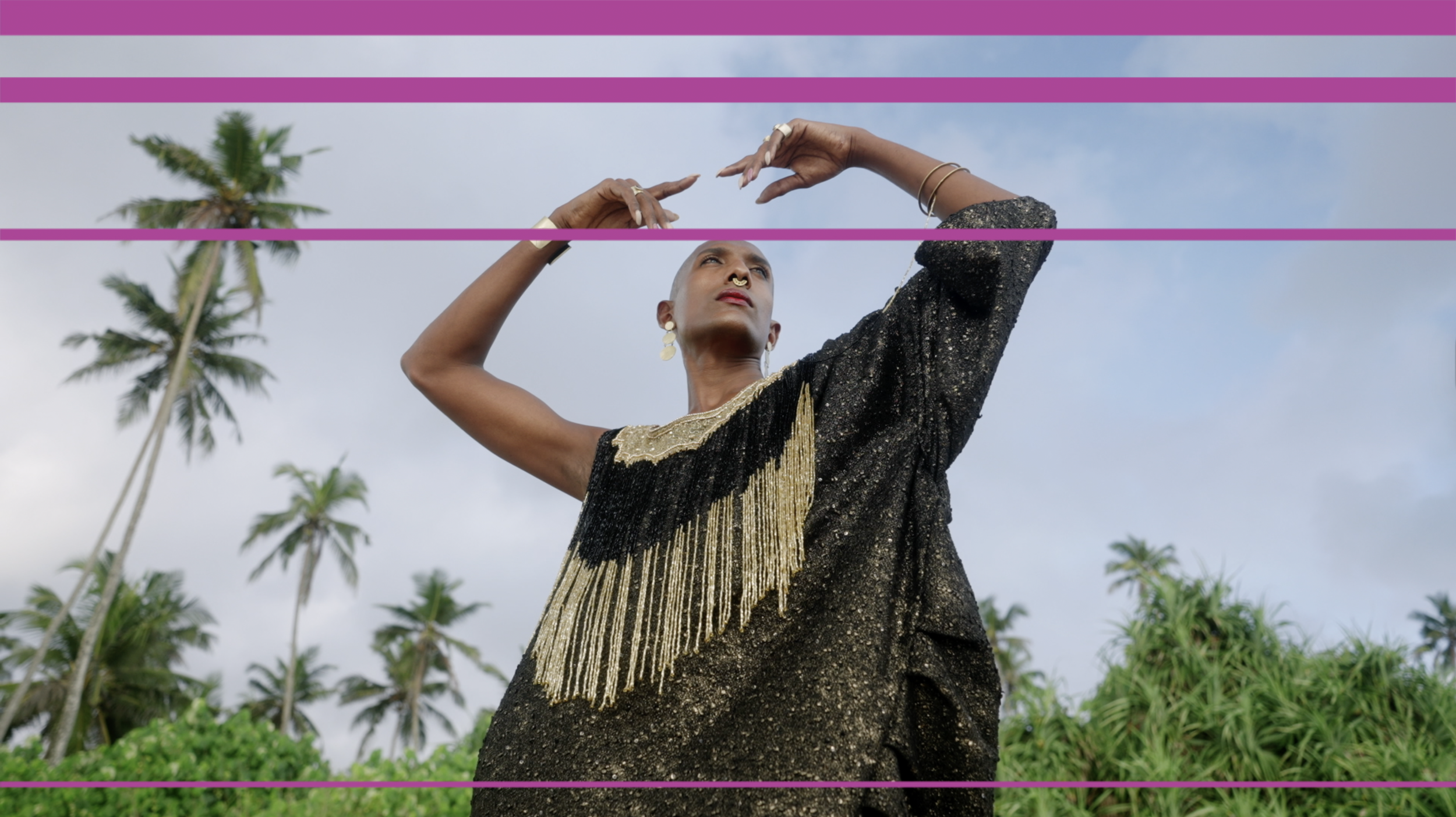
The brand’s new mark is simple, solid, and easily reproducible. It reinforces the name’s shorthand acronym and emphasizes the “T” for trans. The color palette centers on an ownable shade of magenta—unique amongst advocacy organizations—while subtly nodding to the colors of the trans flag. Photography, illustrating A4TE’s work and impact, similarly references diverse trans communities nationwide. Pentagram also developed an additional kit of patterns derived from the logo geometry which can be used in print and digital contexts.
Another key aspect of our collaboration involved showcasing the 'T' in an animated pattern. This pattern incorporates a combination of colors from A4TE's brand palette, brought to life through a sliding animation.
You can check the full case study at this link.
CLIENT
Pentagram design studio, on Giorgia Lupi’s team
ROLE
Motion designer